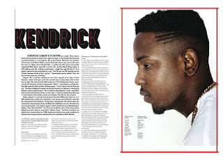
When creating my music double page spread flatplan I looked at other published examples online. One that caught my eye was the Kendrick Lamar article. I liked the simplistic layout and the bold image. The genre of the magazine and the artist also closely linked to my genre of music.When creating my flatplan I decided to incorporate the main image on the furthest side of the page and take up most of the space. In this article there is also overlapping of text on the image. I decided to also include an overlapping column, part of the interview, over my main image. This part of the magazine may link closely to the image in terms of content.

Further looking at some more examples I used this double page spread to influence the start of the body of my text. I was interested in the layout of the artist's name followed with the columns of text. With my flatplan I drew up a box to fit my artist's name and first two columns of text at the bottom half of the first page below my artist's name. Like this double page spread I also included a picture of my own within the text. This will link to the section of the article it is placed by. I will also include a caption to explain the image mirroring this article.

When creating my flatplan for my Music Magazine cover I mainly looked at the magazines Clash and Fader. This is because from my audience response and my own personal preference I found the layout and colour schemes used more appealing. From this specific cover I took inspiration from the placement of the masthead and cover lines. I used this in my own flatplan because I preferred more minimal text to make sure my cover does not look too crowded. I also decided to use a bold masthead placed in the centre because it appears to stand out more and make the artist look more significant. Like this cover I also want to experiment with using white text to allow the colour scheme to be light and coordinating.


Other covers I looked at were various Clash and Fader covers because they are similar to the kind of genre I want to take my magazine down. From looking at these magazines I picked up the convention of putting the artists name in bold towards the bottom of the image. Therefore I decided to include this in my own flatplan to familiarise my audience with the genre conventions. I also found that using the artist's name in this way would attract my target audience more and allow them to familiarise themselves with my artist.
 When creating my music double page spread flatplan I looked at other published examples online. One that caught my eye was the Kendrick Lamar article. I liked the simplistic layout and the bold image. The genre of the magazine and the artist also closely linked to my genre of music.When creating my flatplan I decided to incorporate the main image on the furthest side of the page and take up most of the space. In this article there is also overlapping of text on the image. I decided to also include an overlapping column, part of the interview, over my main image. This part of the magazine may link closely to the image in terms of content.


Comments
Post a Comment